Amazon Case Study
User Experience, Usability
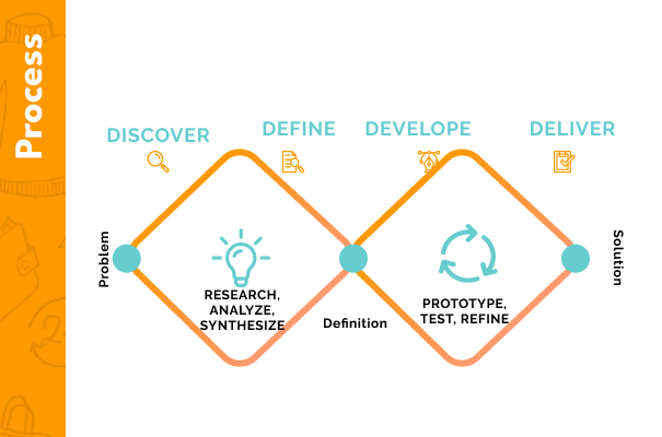
The project aims to redesign clean and intuitive user interface (UI) and improve the user experience (UX) of the Amazon shopping app. The goal is to make the app more visually appealing, intuitive to navigate, and provide a seamless shopping experience for the users, and to reduce the abandonment rate.
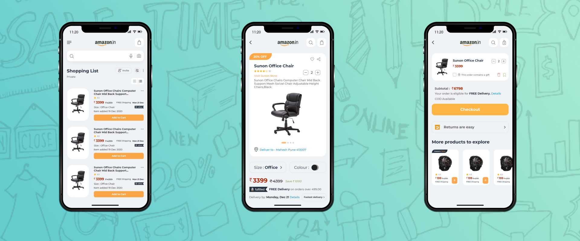
Padding and spacing between elements Cluttered User Interface which is responsible for Confused Accessibility. Lack of Empathy and Design Thinking Too Much Text on screen as well as too many options to choose from. Product screen size and the color available option is old and hence not easy to use. The Pricing, title, and content of the product are too clustered. In listing area arrangement of elements and redesign of the list. On the Product Details page, the whole UI is cluttered and confusing. My cart page is not user friendly.

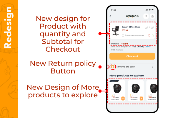
To solve and overcome the above issues first we have to choose a design style for the App Design. I used "Card view Design style" based on skeleton Design style wireframe, along with Ul style, essential UI components- Typography, layouts, color palettes, buttons, font, icons, etc.
Aesthetically pleasing and modern design: The redesign will involve implementing a clean and minimalist design that incorporates the latest design trends and principles. This will improve the visual appeal of the app and make it more user-friendly.